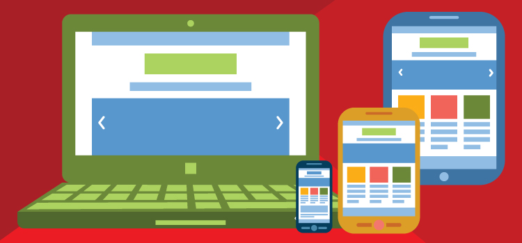
Nowadays, when we talk about web design we assume that we are thinking about mobile and desktop design. Developing different interfaces with css and mediaqueries becomes all a challenge not only for designers but also for programmers.
Although one may think the best way to get started is by developing the desktop design and then moving on to mobile resolutions, the process should be inverse, we need to deliver a solid user experience to a growing number of devices, in addition, it is easier to start with a smaller mobile screen and then scale to a desktop.
So, if you’re developing either a mobile or desktop design, there are a number of things you should consider.
1 – DON’T HIDE DIVS IN RESPONSIVE DESIGN (display: none or visible:0)
We adjust design using CSS Media Queries so we define which elements are visible. Declaring display: none. This is a bad practice that doesn’t make a smaller web, it just doesn’t show the content after downloading it. So users must download a lot of information (images, text) that they will never see.
Even Google isn’t fond of hidden content and you can be penalize for it.
On the other side mobile users do everything desktop users do, so you should be consistent with the information and navigation you provide on your different resolutions. 90% of users access the web on different devices, it would be confusing if they got different information in desktop and mobile devices.
It would be great if you could present the same content in a more functional way for mobile users. In the case you really need to give a different content for mobile users you should use conditional loading. Check this post to have a better idea about this.
2 – GET THE PERFECT HARMONY BETWEEN BEAUTIFUL AND USEFUL
Slow loading on Mobile Pages are really a problem. Many times we give more importance to design than to the content of the page or user experience.
Try to avoid animations and big background images on mobile, they will make your web slow when downloading it and users don’t want to waste time just to see a background.
Our biggest challenge is to provide beautiful, simple, readable, easy to navigate and addictive content. And there are plenty of ways of achieving this, You might want to focus on the information you are giving, make it simple and visual, you can use icons to refer your titles, infographies to explain a complex text and even consider background colors to divide sections or different contents.
3 – HAVE BUTTONS, TEXT, AND IMAGES THE PERFECT SIZE?
About the text.
We often make everything smaller just to make sure our design fits on a small Smartphone screen, as a result, we end up with a menu which is impossible to tap on, call to action buttons so small that it will never catch our attention, or images too small that users probably need to zoom them.
Make a clean and comfortable design, use margins and white space, they give air to your design, be sure the fonts you choose are perfectly legible, a mobile screen, is smaller but that doesn´t allow you to make the font too small. Mobile users prefer scrolling down than making zoom.
On desktop if you have a long text, it is better to present it in two or three columns, so you will not have to read very long phrases. However, when you have a smaller screen try to avoid presenting content in columns, they will be very thin.
About the buttons
Another important detail is the size of your buttons, probably in desktop design it is easier for the user to click with the mouse on a text or a Little button, but on mobile phones, it’s important you make sure you have a finger friendly design, it’s best to make your targets big so that they’re easy for users to tap.
Google developers recommend us to use a minimum target area of 48 CSS pixels (width and height) on the most important target. Be sure to give enough space between the buttons so users would not press another link by accident.
The MIT Touch Lab Study of Human Fingertips found that our index finger has an average of 45-57 px width, this is useful to know when we are designing a menu bar or a “call to action button”.
For more information: https://developers.google.com/speed/docs/insights/SizeTapTargetsAppropriately
About the images
With the popularity of retina and high definition displays it is more important for web developers to use high definition images. However, be sure to provide the perfect image resolutions for different devices. The ideal solution would be to send high-resolution versions of images to devices that can use them, while maintaining a standard resolution for others.
Do you think that is impossible? There are a couple of ways of solving this.
– You can Load 2x (double size) images everywhere and set the image height and width to the 1x size (real size).
– Or you can use a JavaScript library to load 2x images. retina.js is a good option. How it works? You need to have the same image twice, the first one with the original size, the second with double size and the same name and adding at the end “@2x”. When you are using a retina display, this plugin will show you the big size images.
4 – TEST TEST TEST
And finally, as a last suggestion test your web on different devices before launching it. Just making the screen of your navigator smaller, doesn’t mean that your web will look good on your Smartphone or Tablet. Test different browsers, they usually surprise us!
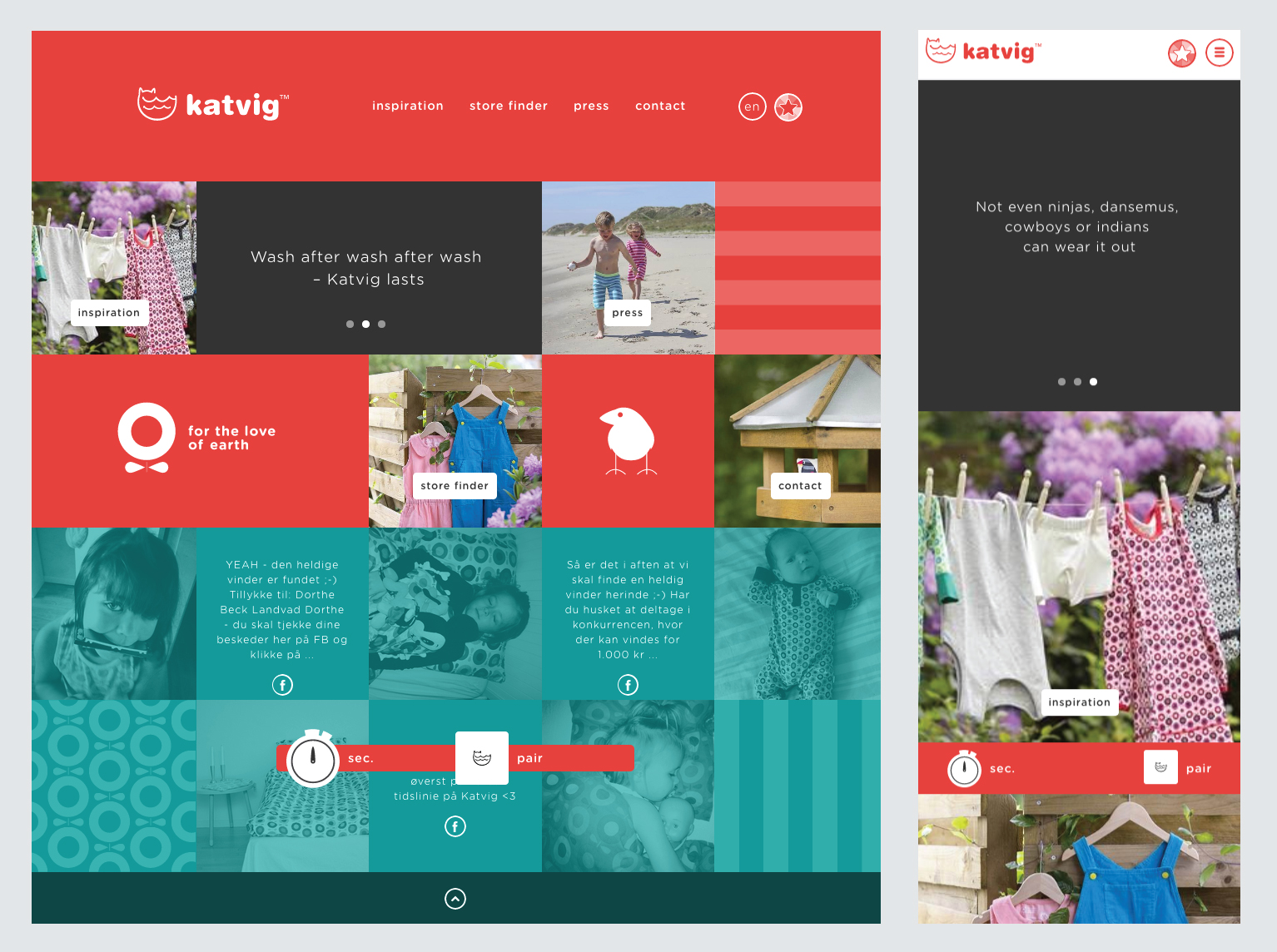
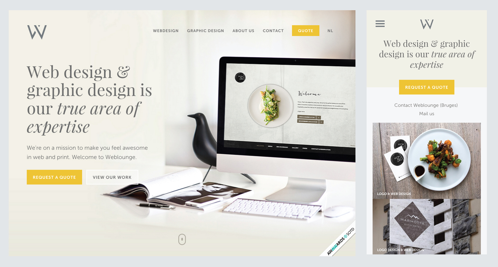
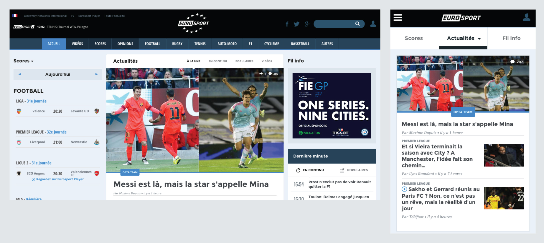
TAKE A LOOK TO THESE EXTRAORDINARY RESPONSIVE WEBSITES